








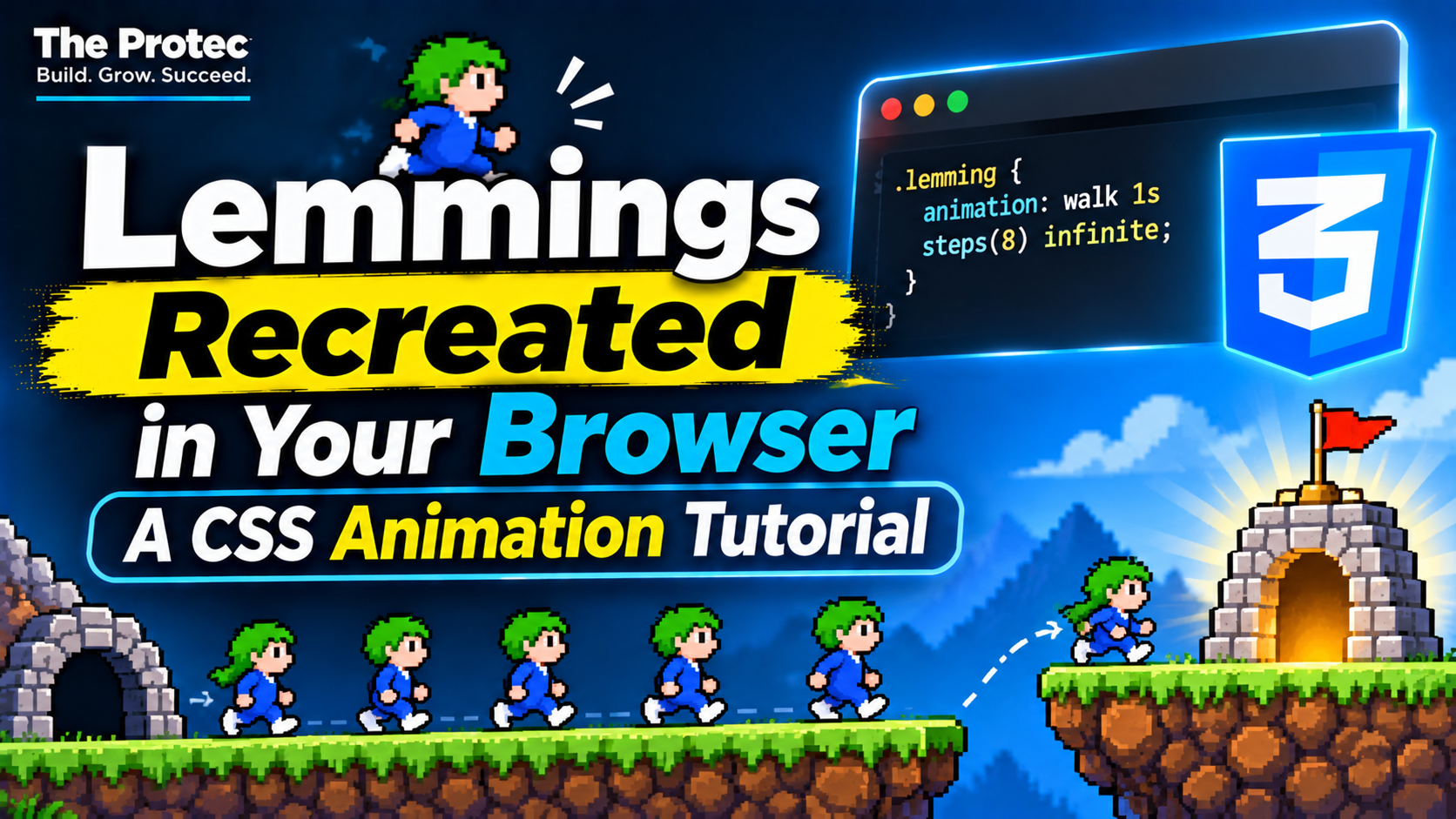
A line of tiny characters marching across a browser window can feel surprisingly alive. This CSS animation tutorial examines how a Lemmings-inspired interactive scene can be built with ordinary HTML, CSS, and JavaScript—no traditional game engine required. The goal is not to reproduce the complete commercial game or its copyrighted artwork. Instead, we will use original, generic characters to understand the techniques behind sprite animation, continuous movement, DOM-based interactions, responsive paths, and accessible controls.
The original interactive Lemmings-style web project and the reporting it inspired are useful because they demonstrate an important idea: familiar game-like motion can emerge from standard browser features. CSS keyframes handle repeatable visual states, transforms move characters efficiently, and JavaScript coordinates spawning, direction changes, and user input. These same techniques apply to product tours, playful landing pages, data visualizations, and educational experiences.
How a Lemmings CSS scene works
A browser recreation can be divided into three layers. HTML supplies the stage, platforms, characters, and controls. CSS defines each character’s appearance, walking cycle, direction, and route. JavaScript creates or removes characters, updates timing variables, and responds to buttons or pointer events.
This is different from a traditional game loop that redraws a canvas every frame. Each walker is a DOM element, and the browser’s animation system interpolates its movement. That approach is approachable and easy to inspect, although it becomes less efficient when hundreds or thousands of elements are active.
The central web animation techniques are:
- CSS keyframes: Named sequences that describe walking, bobbing, falling, or crossing the stage.
- Sprite-based character movement: A sprite strip changes its background position in discrete steps while its container moves continuously.
- Transforms:
translateandscaleXmove and turn characters without repeatedly changing layout coordinates. - DOM manipulation: JavaScript clones character nodes, assigns custom properties, and removes finished walkers.
- Input controls: Buttons can pause the scene, add walkers, reverse direction, or reduce the population.
Step-by-step CSS animation tutorial
The following example builds a compact scene with an original CSS-drawn walker. It deliberately avoids artwork, names, audio, levels, and mechanics copied from the commercial game.
1. Create the stage and controls
Start with a stage containing a platform and an empty layer for characters. Native buttons provide keyboard support without extra scripting.
<section class="demo" aria-labelledby="demo-title">
  <h3 id="demo-title">Tiny walkers</h3>
  <div class="stage" id="stage" aria-label="Animated walking scene">
    <div class="walkers" id="walkers"></div>
    <div class="platform" aria-hidden="true"></div>
  </div>
  <div class="controls">
    <button id="add" type="button">Add walker</button>
    <button id="pause" type="button" aria-pressed="false">Pause</button>
    <button id="clear" type="button">Clear</button>
  </div>
  <p id="status" class="status" aria-live="polite"></p>
</section>
2. Draw an original character sprite
A sprite does not have to be an image. This generic character uses CSS shapes, with pseudo-elements for a head and alternating legs. Keeping the walker and sprite as separate elements is useful: the outer element travels across the stage while the inner element performs the walk cycle.
.stage {
  position: relative;
  overflow: hidden;
  min-height: 260px;
  container-type: inline-size;
  background: linear-gradient(#16243a, #315b72);
}
.platform {
  position: absolute;
  inset: auto 0 38px;
  height: 22px;
  background: #66754a;
  border-top: 6px solid #9aae67;
}
.walker {
  position: absolute;
  left: 0;
  bottom: 66px;
  animation: travel var(--duration, 8s) linear forwards;
  will-change: transform;
}
.sprite {
  position: relative;
  width: 18px;
  height: 24px;
  border-radius: 7px 7px 4px 4px;
  background: #4fc4b5;
  transform: scaleX(var(--direction, 1));
  animation: bob 240ms steps(2, jump-none) infinite;
}
.sprite::before {
  content: "";
  position: absolute;
  width: 12px;
  height: 12px;
  left: 3px;
  top: -8px;
  border-radius: 50%;
  background: #f0bd87;
  box-shadow: 0 -3px 0 #284f3e;
}
.sprite::after {
  content: "";
  position: absolute;
  left: 2px;
  bottom: -5px;
  width: 5px;
  height: 7px;
  background: #273149;
  box-shadow: 9px 2px 0 #273149;
}
@keyframes travel {
  from { transform: translate3d(var(--from), 0, 0); }
  to { transform: translate3d(var(--to), 0, 0); }
}
@keyframes bob {
  from { translate: 0 0; }
  to { translate: 0 -2px; }
}
.stage.is-paused .walker,
.stage.is-paused .sprite {
  animation-play-state: paused;
}
If you create your own sprite sheet, replace the CSS-drawn figure with a fixed-size element. A four-frame strip could use background-image: url('/images/original-walker-strip.png'), background-size: 96px 24px, and animation: frames 400ms steps(4) infinite. The corresponding keyframes move background-position from 0 0 to -96px 0. The steps() timing function is essential because it switches frames rather than blending them.
3. Spawn and control multiple characters
JavaScript can assign a different duration and direction to every walker. CSS still performs the per-frame animation, so the script does not need to update each position continuously.
const stage = document.querySelector('#stage');
const layer = document.querySelector('#walkers');
const status = document.querySelector('#status');
const reduceMotion = matchMedia('(prefers-reduced-motion: reduce)');
let paused = false;

function addWalker(direction = Math.random() > .5 ? 1 : -1) {
  if (reduceMotion.matches && layer.children.length >= 3) return;

  const walker = document.createElement('div');
  const sprite = document.createElement('div');
  const width = stage.clientWidth;
  const from = direction === 1 ? -30 : width + 30;
  const to = direction === 1 ? width + 30 : -30;

  walker.className = 'walker';
  sprite.className = 'sprite';
  walker.style.setProperty('--from', `${from}px`);
  walker.style.setProperty('--to', `${to}px`);
  walker.style.setProperty('--duration', `${6 + Math.random() * 4}s`);
  walker.style.setProperty('--direction', direction);
  walker.append(sprite);
  layer.append(walker);
  walker.addEventListener('animationend', () => walker.remove());
}

document.querySelector('#add').addEventListener('click', () => addWalker());
document.querySelector('#clear').addEventListener('click', () => {
  layer.replaceChildren();
  status.textContent = 'All walkers removed.';
});
document.querySelector('#pause').addEventListener('click', event => {
  paused = !paused;
  stage.classList.toggle('is-paused', paused);
  event.currentTarget.textContent = paused ? 'Resume' : 'Pause';
  event.currentTarget.setAttribute('aria-pressed', String(paused));
  status.textContent = paused ? 'Animation paused.' : 'Animation resumed.';
});

for (let i = 0; i < 6; i++) setTimeout(addWalker, i * 500);
This pattern scales better than running one setInterval per character. It also keeps presentation in CSS and behavior in JavaScript. For interactions that need precise seeking, reversing, or synchronization, the browser’s Web Animations API provides JavaScript access to animation timing while retaining browser-managed interpolation.
Adding paths and basic interactions
A straight crossing is enough for a demonstration, but a richer CSS game animation can use nested elements for separate movement axes. The parent moves horizontally while a child performs a short fall or climb. CSS motion paths with offset-path can follow curves, although a transform-based fallback is prudent when consistent behavior across embedded or older browser environments matters.
Platforms can also act as interaction targets. A click handler might set a walker’s --to value, add a class that changes its animation, or call element.animate() with a new set of keyframes. For game-like state—such as assigning a temporary role—store data in JavaScript and reflect only the visual state through classes and attributes.
Avoid treating the DOM as a physics engine. Collision detection, pathfinding, and densely populated levels demand more coordination than this simple HTML CSS animation. Canvas, WebGL, or a purpose-built engine becomes more suitable when every character must interact with changing terrain at high frequency.
Performance with many animated DOM elements
Every walker adds nodes, styles, paint work, and memory use. The exact limit depends on character complexity, device hardware, browser, viewport, and other page activity, so there is no universal safe population count. Measure the actual experience with browser performance tools.
- Prefer transforms and opacity. Animating
left,top, width, or margins can trigger layout and paint. Transform-based movement usually avoids layout recalculation for every frame. - Keep sprites simple. Large shadows, filters, masks, and oversized transparent images increase painting or compositing costs.
- Use
will-changeselectively. It can encourage compositor promotion, but applying it to many permanent elements consumes resources. Remove it when animation ends if walkers persist. - Batch DOM changes. Build several characters in a
DocumentFragment, then append them together rather than repeatedly mixing DOM reads and writes. - Remove completed elements. The example listens for
animationend, preventing invisible walkers from accumulating. - Test browser differences. Fractional pixel rounding, sprite sampling, timer throttling, and compositor behavior can vary. Test Chromium, Firefox, and Safari rather than assuming identical output.
Developer tools can reveal whether an animation causes repeated layout, paint, or long main-thread tasks. A visually smooth desktop test is not enough; also test a mid-range mobile device, background-tab recovery, zoom, and a page containing other scripts.
Responsive design and accessible motion
Movement distances should come from the stage rather than the viewport. The example reads stage.clientWidth when each walker is created, allowing the component to sit inside a flexible column. If the container can resize while a character is crossing, use a ResizeObserver to update future routes or restart active animations from their current progress.
On narrow screens, shorten the stage, reduce the population, and maintain sufficiently large controls. Do not shrink interactive buttons merely to preserve the scenery. Decorative characters should remain outside the accessibility tree; meaningful status changes belong in restrained live-region text.
Motion can cause discomfort or distraction. Respect the user’s system preference and provide an explicit pause control:
@media (prefers-reduced-motion: reduce) {
  .walker, .sprite { animation: none; }
  .walker { transform: translate3d(16px, 0, 0); }
}
The prefers-reduced-motion media feature is a starting point, not a replacement for user choice. A pause button should stop both travel and walk cycles, retain a clear label, expose its pressed state, and work by keyboard. For essential information, provide a static alternative rather than communicating only through movement.
What this experiment teaches
A Lemmings CSS experiment is compelling because many small, repeated motions produce the impression of a coordinated world. The underlying implementation remains understandable: DOM nodes represent actors, CSS keyframes create rhythm, transforms define routes, and JavaScript changes state.
That simplicity also establishes the boundary. This tutorial recreates the visual idea of tiny independent walkers, not the original game’s assets, levels, branding, or complete mechanics. Use original artwork and sounds, and treat the commercial game as historical inspiration rather than material to copy.
Frequently asked questions
Can a complete retro game be built with CSS alone?
CSS can produce convincing movement, sprite cycles, transitions, and simple interactions. A complete game normally needs JavaScript for rules, state, input, collision handling, scoring, and persistence. More demanding rendering may be better suited to Canvas or WebGL.
Are CSS keyframes faster than JavaScript animation?
Neither is automatically faster in every situation. CSS animations and the Web Animations API let the browser manage interpolation and can perform well when limited to transforms and opacity. JavaScript is appropriate when values depend on live simulation, but per-frame DOM work must stay within the rendering budget.
How do I animate dozens of walkers at once?
Reuse a small DOM structure, vary behavior with CSS custom properties, stagger creation, animate transforms, and delete finished nodes. Profile on representative mobile hardware. If the population or interaction model becomes too complex, consolidate rendering onto Canvas rather than endlessly optimizing individual elements.
Do I need a copyrighted Lemmings sprite sheet?
No. Create an original sprite strip, draw a generic character with CSS, or commission artwork. The techniques do not depend on the original game’s protected visual assets, and using original material makes the demonstration easier to publish and adapt.